Did it arrive?
Sent, delivered, bounced and failed are counted separately, and every single message keeps its own state — when it was sent, when it was delivered, when it failed, and the reason and code the channel gave for the failure.
Every message you send is counted on its own — delivered, bounced, opened, clicked, unsubscribed. The report is a sum of what happened, over the dates you pick, for email, SMS and WhatsApp together.
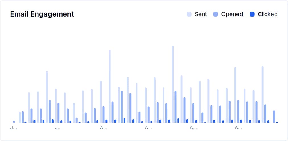
You paid for those messages. If the only thing that comes back is the word “sent”, you cannot tell a campaign that earned its keep from one that quietly burnt down your list. Three questions decide it, and the reports answer all three.
Sent, delivered, bounced and failed are counted separately, and every single message keeps its own state — when it was sent, when it was delivered, when it failed, and the reason and code the channel gave for the failure.
Opens and clicks are recorded against the exact message they came from, then rolled up into the campaign. You get open rate, click rate and click-to-open rate, plus the links people actually clicked, ranked.
Unsubscribes, complaints and bounces are tracked alongside a list-health score out of 100 and an A to F grade, so you can see the cost of a send that pushed too hard.
Nothing here is modelled, sampled or projected. Each figure is a count of rows that a real event wrote.
Every recipient gets their own message record, carrying the campaign it belongs to, the channel, the contact, and a status that starts at sent.
Delivery callbacks from the email, SMS and WhatsApp providers move that record to delivered, bounced or failed — and a failure keeps the reason and the code it came with.
An email open or a link click is written against that message and against the contact. An open adds 1 to the contact engagement score; a click adds 5, because a click is worth more.
For the dates you choose, the totals are summed and the rates computed: opens and clicks over delivered, bounces over sent. A campaign counts a contact’s first open and first click once; the message keeps the full count of every reopen.
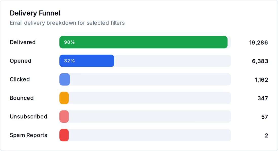
Sent, delivered, opened, clicked — each stage with its count and its share of what you sent. The gap between two bars is the problem worth fixing, and it tells you which one: a delivery gap is a list or sender problem, an open gap is a subject-line problem, a click gap is a content problem.
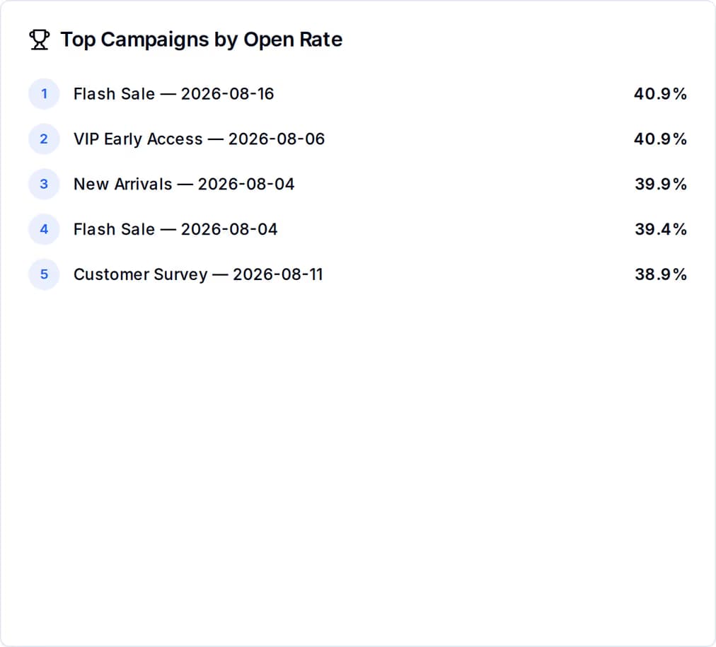
Every campaign in the window, ranked by the rate you care about, with the raw counts beside it. This is where you find the message worth repeating and the one worth retiring.
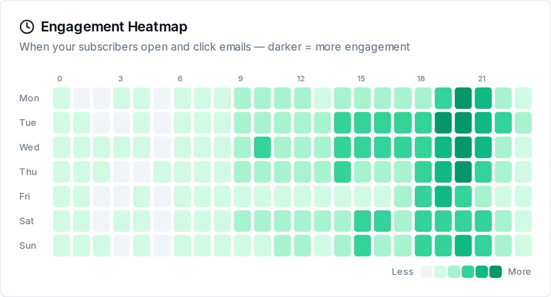
A seven-day by twenty-four-hour grid, built from the opens and clicks your own email earned. Darker cells are the hours your people were paying attention. A separate best-time analysis ranks all twenty-four hours and flags the strongest three, counting a click as worth two opens.
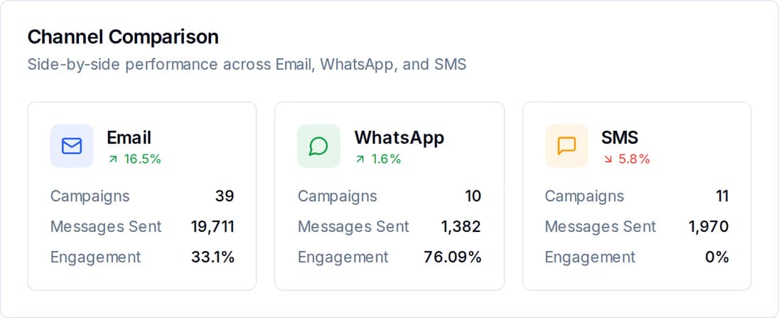
Most tools make you open three dashboards and do the arithmetic yourself. Here the three channels sit in one table for the same date range, with the same columns, so the comparison is a glance rather than a spreadsheet.
Pick the question you have, and this is where the answer lives and how you get it out.
| The question it answers | Broken down by | You can take it away as | |
|---|---|---|---|
| Campaign performance | Did this send land, and did anyone read it? | Campaign, brand, channel | CSV or JSON from the API; PDF, Word or Excel on screen |
| Delivery funnel | At which stage do recipients fall away? | Stage, as a share of what you sent | PDF, Word or Excel |
| Send-time heatmap | When is my list actually reading? | Day of week and hour, your timezone | PDF, Word or Excel |
| Channel comparison | Which channel is worth the money? | Email, SMS, WhatsApp | PDF, Word or Excel |
| Contact and list health | Is my audience growing or decaying? | Status, source, tags, engagement score | CSV or JSON |
| Engagement activity log | Who opened or clicked, and when? | Contact, activity type, campaign, timestamp | CSV or JSON |
You should not have to read a dashboard every morning to find out something went wrong. Fixed thresholds are checked for you, and each warning names the number that tripped it and links straight to the list or the campaign involved.
Too many addresses are dead. Left alone this damages how the receiving mail servers treat everything else you send.
People are marking you as spam rather than unsubscribing. The warning points you at the campaigns that caused it.
Usually a frequency problem before it is a content problem. You get told before the list is meaningfully smaller.
One score built from your active-contact rate, bounce rate, unsubscribe rate and average engagement, graded A to F.
Two quieter notices sit alongside them: contacts who have not engaged in thirty days or more, and drafts you started and never finished.
One thing on this page is worth knowing before you buy rather than after. Counts are reported per campaign. Money is not — cost is totalled per channel over a date range, and there is no cost column on a campaign anywhere in the product or in the export.
| Per campaign | Per channel, per date range | |
|---|---|---|
| Recipients, sent, delivered | Yes | Yes |
| Opens, clicks, click-to-open | Yes | Yes |
| Bounces, failures, unsubscribes, complaints | Yes | Yes |
| Delivery, open and click rates | Yes | Yes |
| Money spent | No | Yes |
Channel spend for a period is the same figure your invoice is built from, so the two reconcile. WhatsApp isn't part of that invoice at all: Meta bills you directly for it, at Meta's own rate, so there's no QuickGrow wallet and no transaction list behind it here. If you want an approximate cost for one campaign, divide the channel total by the messages that channel sent in the same window.
There is no revenue field on a campaign and no cost field either, so the product will not hand you a per-campaign return. Two other gaps worth knowing: the contact export identifies people by their contact record and their tags rather than by their email address, and the reports carry no location data at all.
The same numbers, three ways out, depending on whether you are looking, sending them to someone, or feeding them into something else.
From your own sends. Each message is a record; delivery callbacks from the channel and the tracking on your email update it; the report sums those records for the dates you pick. Nothing is estimated, sampled or filled in with a placeholder.
No, and it is better that you know now. Per-campaign figures are counts and rates only. Spend is totalled per channel over the date range you choose, which is the figure that reconciles against your invoice — WhatsApp isn't in that invoice at all, since Meta bills you directly for it. To approximate one campaign, divide the channel total by the messages that channel sent in the same window.
Opens divided by delivered, clicks divided by delivered, and click-to-open is clicks divided by opens. Bounce rate is measured against sent. A campaign counts a contact once, on their first open and first click; the individual message keeps the full count of every reopen and every repeat click, so you can tell one enthusiastic reader from a thousand.
Send on email, SMS and WhatsApp, and read one set of numbers across all three.
 CyberCraft BangladeshQuickGrow AI
Run every channel from one platform. Bring your own SMTP, SMS gateway, and WhatsApp number — or use ours.
See pricing →